
Joomla Bootstrap classes give site builders a practical way to create responsive columns, consistent spacing, and clearly styled calls to action without writing one-off CSS for every content block. This tutorial focuses on the bundled Cassiopeia frontend template in Joomla 6.1.3 and Joomla 5.4.8, current as of August 21, 2026. Those releases declare Bootstrap ^5.3.8, while their verified Cassiopeia source imports the full Bootstrap SCSS bundle. That makes standard Bootstrap 5 grid, spacing, button, display, and flex utilities available in these specific template versions.
Bootstrap support is nevertheless template-dependent. A third-party Joomla template may compile only part of Bootstrap, use another framework, alter class behavior, or load a different version. The examples below therefore apply directly to the verified Cassiopeia versions and should be checked separately in any other template. You will start with a small user.css customization, build mobile-first content layouts, add responsive buttons, enhance module wrappers, and learn when Bootstrap CSS alone is not enough.
What Bootstrap means in modern Joomla
Bootstrap is a frontend framework that supplies reusable CSS classes and optional JavaScript behaviors. Joomla includes it as a core dependency, but the active frontend template determines which framework assets visitors actually receive. The Joomla 6.1.3 and 5.4.8 manifests declare a Bootstrap dependency of ^5.3.8, as shown in the official Joomla 6.1.3 manifest and Joomla 5.4.8 manifest. This dependency notation should not be interpreted as proof of one exact resolved package build in every possible installation.
The verified Cassiopeia source for Joomla 6.1.3 and Joomla 5.4.8 imports Bootstrap functions, variables, maps, mixins, utilities, and the full SCSS bundle. Consequently, the standard classes demonstrated in this tutorial are available when either verified Cassiopeia version is active.
Cassiopeia does not use the Bootstrap grid as the sole architecture for its entire page. Its overall page shell uses CSS Grid, while Bootstrap rows and columns are useful inside articles, Custom HTML modules, template overrides, and component output. Official Cassiopeia customization guidance explains the template's responsive design and supported approaches to customization.
Joomla Bootstrap version and template check

As of August 21, 2026, this tutorial targets Joomla 6.1.3 as the current stable feature series and Joomla 5.4.8 as the supported previous major series. Official security advisories dated August 18, 2026 direct affected users on earlier releases to upgrade to 5.4.8 or 6.1.3. Consult the Joomla Security Announcements for the cited security guidance.
| Series | Research target | Scheduled support position as of the research date |
|---|---|---|
| Joomla 6.x | 6.1.3 | Regular bug-fix support through October 17, 2028; security-only support through October 16, 2029 |
| Joomla 5.x | 5.4.8 | Regular bug-fix support through October 13, 2026; security-only support through October 12, 2027 |
These are scheduled roadmap dates from the official Joomla Project Roadmap. Joomla 6.2 was still an unreleased beta track on the research date, so it is not used as production guidance here.
Confirm the active template before using the examples
- Identify the frontend template assigned to the page where the layout will appear.
- If it is Cassiopeia in Joomla 5.4.8 or 6.1.3, the classes in this tutorial are covered by the verified template source.
- If it is a third-party or custom template, consult that template's documentation and inspect the rendered page before assuming that Bootstrap 5 classes are available.
- Do not add a second Bootstrap CSS or JavaScript bundle from a CDN merely because a class appears not to work. Duplicate or mismatched framework copies can complicate troubleshooting; first determine what the active template supplies.
Related guidance: update Joomla safely.
Understand the customization layers before changing the layout
Several Joomla terms are easy to confuse. Choosing the smallest appropriate layer helps keep a change understandable and avoids copying more template code than necessary. Official Cassiopeia guidance recommends user.css for simple CSS additions and a child template for more substantial template changes rather than editing supplied template files directly.
user.css: a place for small, lasting CSS additions or overrides associated with Cassiopeia. It is appropriate when Bootstrap almost provides the desired design but a site-specific selector needs a modest adjustment.- Template style: the configured instance of a template used for options and menu assignment. Creating or changing a style is not the same as creating a new template codebase.
- Template override: a customized output layout for a Joomla component or module. It changes generated markup and can provide an appropriate place for Bootstrap classes when editors should not have to enter the same structure repeatedly.
- Child template: a template that depends on and inherits from its parent. A child file at the same path as a parent file replaces that parent file for the corresponding output; the two files are not automatically merged line by line. The parent must remain installed and updated.
- Complete parent-template copy: a duplicated template codebase that must be maintained separately. Beginners should not copy all of Cassiopeia merely to add a grid or a few CSS rules.
A child template protects your changes from direct edits to supplied parent files, but it is not maintenance-free. Parent updates can change markup, behavior, or assumptions on which a child file depends. Keep the parent installed and patched, review customized files after updates, and test a child by assigning it to a test menu item before considering it as the site default. Backups, staging, accessibility checks, and responsive tests are recommended workflow safeguards; they are not automatic benefits produced by a child template.
For additional layout and styling ideas, see how to customize the Cassiopeia template without editing supplied files directly.
A safe step-by-step Joomla Bootstrap workflow
Step 1: Begin with a small user.css customization
Before building a larger layout, confirm that you can apply one site-specific class predictably. With the appropriate Site Templates permissions, use the template editing facilities described in the official Cassiopeia customization documentation to add a small rule to user.css. Do not edit Cassiopeia's supplied CSS files.
.jf-feature {
  border: 1px solid currentColor;
  border-radius: .5rem;
}
Then apply that selector together with Bootstrap spacing classes in an article or Custom HTML module:
<section class="jf-feature p-4 my-4">
  <h2>A featured service</h2>
  <p>Replace this text with a concise description of the service.</p>
</section>
This first exercise separates responsibilities: Bootstrap provides the padding and vertical margin, while user.css handles a site-specific border treatment. Utility classes can reduce repetitive custom declarations, but they do not eliminate every need for custom CSS.
Step 2: Choose where the classes belong
You can add Joomla layout classes in several places, depending on who will maintain the content:
- Article markup: suitable for a layout unique to one article, provided the editor and text-filter configuration preserve the intended HTML and class attributes.
- Custom HTML module markup: suitable for a reusable promotional or informational block.
- Module Class: suitable for adding classes to the module container without changing its inner content.
- Template override: useful when the same structured markup should be generated repeatedly by a component or module.
user.cssor a child template: appropriate when the change goes beyond combining existing Bootstrap classes.
Always inspect the final page. Editors, text filters, module chrome, template overrides, and extensions may alter either entered or generated markup.
Related guidance: build a Joomla template override.
Step 3: Build mobile-first and test progressively
Start with the smallest viewport behavior, then add breakpoint-prefixed classes for wider screens. Avoid beginning with a desktop arrangement and trying to repair it for mobile afterward. Test the rendered result at narrow, medium, and wide viewport sizes, and inspect the source order rather than judging visual order alone.
Bootstrap grid basics: containers, rows, and columns

Bootstrap 5.3 uses a mobile-first, flexbox-based, responsive 12-column grid with six default tiers. The unprefixed tier applies from the smallest viewport upward. The named minimum-width breakpoints are sm at 576px, md at 768px, lg at 992px, xl at 1200px, and xxl at 1400px. Rows wrap columns, while responsive column widths and padding-based gutters control their arrangement. See the official Bootstrap 5.3 grid documentation for the complete model.
Inside a Joomla article's existing content area, you often need only a row and its columns. Adding another container around every block may create unnecessary nesting. Follow three beginner rules:
- Place grid columns inside a
row. - Define the smallest-screen behavior first.
- Use a breakpoint prefix only where the layout should change.
Example: responsive two-column feature section
<section class="row g-4 align-items-center my-4">
  <div class="col-12 col-md-6">
    <h2>Plan the content</h2>
    <p>Put the most important information first in the source.</p>
  </div>
  <div class="col-12 col-md-6">
    <h2>Build the layout</h2>
    <p>Use the responsive grid only after the reading order makes sense.</p>
  </div>
</section>
Each column uses col-12, so it occupies the available row width on the smallest screens. At the md breakpoint and above, col-md-6 gives each column six of the grid's 12 columns. The result is a stacked mobile layout that becomes two columns from the medium breakpoint. The g-4 class adds horizontal and vertical gutter spacing.
Example: a three-item row-cols layout
For repeated features, row-cols-* classes can set the number of child columns at the row level:
<section class="row row-cols-1 row-cols-md-3 g-4 my-4">
  <div class="col">
    <article class="h-100 p-4 border rounded-3">
      <h3>Audit</h3>
      <p>Review the content and its logical order.</p>
    </article>
  </div>
  <div class="col">
    <article class="h-100 p-4 border rounded-3">
      <h3>Build</h3>
      <p>Add rows, columns, gutters, and spacing.</p>
    </article>
  </div>
  <div class="col">
    <article class="h-100 p-4 border rounded-3">
      <h3>Test</h3>
      <p>Check responsive and keyboard behavior.</p>
    </article>
  </div>
</section>
The row shows one item per row initially and three from the medium breakpoint. The semantic article elements remain in logical source order. Do not use visual column reordering as a substitute for arranging the source meaningfully; visual and reading order can diverge for keyboard and assistive-technology users.
Spacing utilities: margin, padding, gap, and gutters
Bootstrap supplies responsive shorthand utilities for margin, padding, and gap. The documented pattern combines a property, optional side, optional breakpoint, and size. For example, p-4 applies padding, mb-3 applies margin at the bottom, and gap-2 creates space between supported grid or flex children. Breakpoint forms such as mb-md-0 change the value from that breakpoint upward. The logical side abbreviations s and e mean start and end, making them more suitable for left-to-right and right-to-left layouts than hard-coded left and right assumptions. The full notation is documented in Bootstrap's spacing guide.
m-*: margin on all sides.mt-*,mb-*,ms-*, andme-*: margin on selected logical sides.p-*and its side variations: padding.gap-*: spacing between suitable grid or flex children.g-*: horizontal and vertical grid gutters.gx-*andgy-*: horizontal or vertical gutters.g-0: removal of grid gutters.
Choose a small, consistent spacing scale rather than layering many utilities until a block happens to look right at one screen width. Remember that gutters separate grid columns, while padding creates space inside an element and margin creates space outside it.
Buttons and responsive calls to action
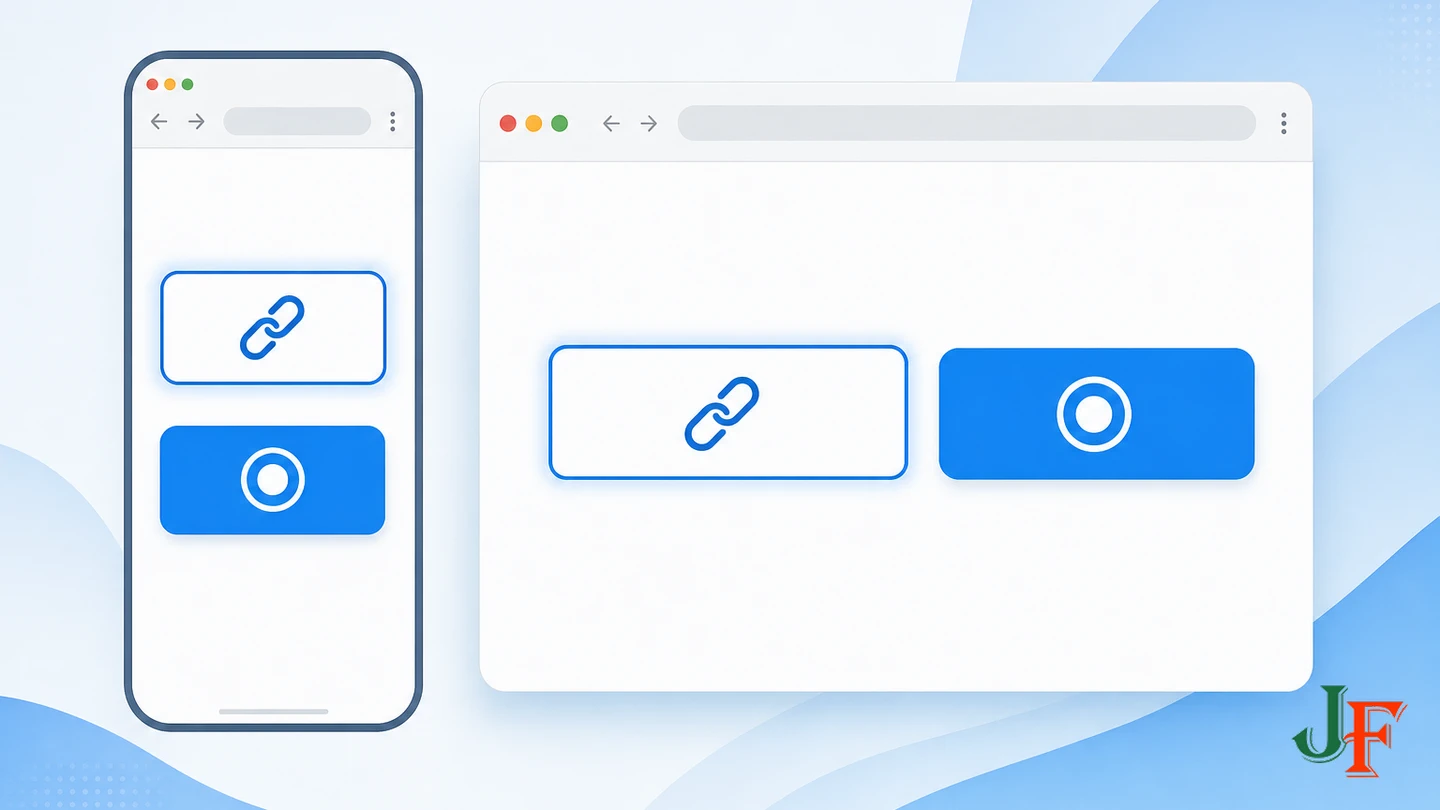
Bootstrap button styling requires the base btn class plus a variant such as btn-primary, btn-secondary, or btn-outline-primary. Optional sizes include btn-lg and btn-sm. These combinations are defined in the official Bootstrap 5.3 button documentation.
Use an anchor when the control navigates to another resource. Use a button element for an action handled on the current page. Classes determine appearance; they do not change an element's semantic purpose.
<div class="d-grid gap-2 d-md-flex my-4">
  <a class="btn btn-primary"
     href="https://getbootstrap.com/docs/5.3/layout/grid/"
     target="_blank"
     rel="noopener noreferrer">Read the grid guide</a>
  <a class="btn btn-outline-primary"
     href="https://getbootstrap.com/docs/5.3/components/buttons/"
     target="_blank"
     rel="noopener noreferrer">Review button options</a>
</div>
The d-grid and gap-2 classes create a spaced, stacked arrangement on smaller screens. From the medium breakpoint, d-md-flex changes the layout to flex. Test button colors against their actual background: Bootstrap classes do not guarantee adequate contrast in every customized color scheme, and some light variants are intended for dark backgrounds.
A disabled-looking link needs more than a disabled class. Bootstrap recommends aria-disabled, removal from the tab order, and functional prevention where necessary. If a destination should not be available, omitting the link may be clearer than presenting an apparently disabled control.
Useful layout utilities without excessive markup
Display, flex, alignment, text, and sizing utilities can solve small layout problems without another custom selector. Useful patterns include:
d-flexto establish a flex layout where the content relationship calls for one.align-items-centerto align flex or grid items on the relevant axis.gap-2orgap-3to separate children consistently.h-100to let repeated inner panels use the available column height.text-center text-md-startwhen centered small-screen text should align to the logical start from the medium breakpoint.
Use these classes to express an understandable layout rule, not simply to accumulate declarations in the class attribute. Responsive hiding and visual reordering require particular care because important content can disappear or appear in a sequence different from the logical source order.
Using Bootstrap classes in Joomla module settings

Joomla's Module Class field appends a class to the module container, while Module Style controls the surrounding module chrome or wrapper. Cassiopeia includes card and noCard module styles in addition to standard Joomla styles. These behaviors are described in the official Module Styles documentation.
With permission to edit Site Modules, you might add classes such as p-4 and mb-4 through Module Class. However, do not assume that the resulting class will sit on the exact element you imagined. The selected Module Style, template chrome, and an override may add wrappers or classes such as card or no-card. Inspect the rendered module with browser developer tools and verify:
- which element received the Module Class value;
- which wrappers were generated by Module Style;
- whether existing padding or margins duplicate the new utilities; and
- whether the module remains readable at each breakpoint.
Related guidance: understand Joomla Module Styles.
When custom CSS, an override, or a child template is better
Bootstrap utilities are most useful when an existing class accurately describes the requirement. Choose another customization layer when:
- a branded visual rule will be reused and deserves a meaningful site-specific class;
- editors should not maintain complicated structural markup;
- a component or module should generate the same accessible structure repeatedly;
- the design requires changes to template output rather than content alone; or
- a substantial template customization needs to be separated from supplied Cassiopeia files.
Use user.css for simple Cassiopeia CSS additions, an override for controlled output markup, and a child template for broader template changes. Never edit supplied Cassiopeia CSS or PHP files on the assumption that those edits are update-safe. A child template is safer than direct parent edits, but its overridden files still require review as the installed and updated parent evolves.
Related guidance: create a Joomla child template.
CSS-only classes versus interactive Bootstrap components
The grid, spacing utilities, display utilities, and standard button appearance used in this tutorial are CSS-focused. They do not need a Bootstrap JavaScript behavior merely to produce their layouts or styling.
Collapses, toggles, modals, tabs, and dismissible alerts are different because their behavior requires the relevant JavaScript support. Joomla uses a modular approach rather than automatically loading every interactive Bootstrap component on every page. This conceptual distinction is documented in Using Bootstrap Components in Joomla 4. That page is Joomla 4-labelled, so it should be used here only for the CSS-versus-interactive-JavaScript distinction, not as unverified current PHP helper guidance.
If a grid or button appearance works but a collapse or modal does nothing, adding more CSS classes will not provide the missing behavior. Determine whether the active template or extension has loaded the relevant component JavaScript. Do not solve the problem by automatically adding a second all-inclusive Bootstrap bundle from a CDN.
Common mistakes and troubleshooting

The classes have no visible effect
Confirm the active template first. The examples are verified for Cassiopeia in Joomla 5.4.8 and 6.1.3, not every third-party template. Then inspect the final HTML to see whether the editor or text filters removed the class attribute.
Columns do not stack as expected
Check that every column is a child of a row and that the mobile-first classes say what you intend. For example, col-12 col-md-6 means full width initially and half width from the medium breakpoint. Do not use older Joomla 3 Bootstrap 2 syntax such as span6 in these Bootstrap 5 examples.
The layout has unwanted horizontal space
Inspect nested containers, row gutters, column padding, and custom margins. Avoid adding containers automatically inside an article that already sits in Cassiopeia's content container. Use g-*, gx-*, and gy-* deliberately rather than combining them at random.
A module looks different from the same markup in an article
Inspect the module wrapper. Module Style and template chrome may add structure and existing classes around the content, so the same inner markup can be affected by different surrounding CSS.
A collapse, modal, or toggle does not respond
These are interactive components. Confirm that the relevant Bootstrap JavaScript behavior is loaded by the responsible template or extension. CSS availability alone does not establish interactive behavior.
Buttons are difficult to read
Test foreground and background contrast in the site's actual color scheme, including hover and focus states. Changing a variant or adding a border may alter appearance, but the final combination still needs accessibility testing.
A customization disappeared after an update
Check whether the change was made directly in a supplied template file. Move simple CSS changes to user.css and assess whether more substantial work belongs in an override or child template. Continue to review those customizations after parent-template updates.
Accessibility, security, performance, and maintenance checklist
- Security: keep Joomla on a current patched release. As of the research date, official advisories directed affected users to 5.4.8 or 6.1.3.
- Template scope: verify Bootstrap support in the active template instead of assuming universal compatibility.
- Semantics: retain meaningful headings, sections, articles, links, and buttons. Styling does not change semantic purpose.
- Source order: arrange information logically before changing its visual layout.
- Keyboard access: operate links and interactive controls by keyboard and confirm that focus remains visible.
- Contrast: test text, button, hover, and focus colors against their rendered backgrounds. Bootstrap classes do not make a layout automatically accessible.
- Responsive behavior: test the examples at the actual breakpoints and check that responsive hiding does not remove essential information.
- Generated markup: inspect editor output, module wrappers, template chrome, overrides, and component output.
- Maintenance: keep simple changes in
user.css; use overrides or a child template where justified; do not edit supplied Cassiopeia files directly. - Performance: utility classes can reduce repetitive one-off CSS, but do not assume or quantify a performance improvement without page-level testing.
- SEO: Bootstrap classes do not directly improve search rankings. Preserve useful content, meaningful headings, semantic markup, and logical source order.
Frequently asked questions
Is Bootstrap already available in Joomla?
Joomla 6.1.3 and 5.4.8 declare Bootstrap ^5.3.8 as a dependency, and the verified Cassiopeia versions import the full Bootstrap SCSS bundle. Frontend availability still depends on the active template, so third-party templates require separate verification.
Can I use Bootstrap classes inside an article?
Yes, when the active template supplies the corresponding CSS and the editor and text-filter configuration preserve the markup. Inspect the rendered result rather than relying only on what appears in the editor.
Do I need to load Bootstrap from a CDN with Cassiopeia?
No additional CDN copy is required for the verified CSS examples in Cassiopeia 5.4.8 or 6.1.3. Adding another framework copy can introduce conflicts or version mismatches.
Why does my two-column layout remain stacked?
Check the viewport width and class names. col-12 col-md-6 is intentionally stacked below the 768px medium breakpoint and becomes two columns at that breakpoint and above.
Should I use user.css or a child template?
Use user.css for simple Cassiopeia CSS additions. Consider a child template for more substantial template changes. Keep the parent installed and updated, test the child on a test menu item first, and review overridden child files after parent changes.
Why does a Bootstrap collapse not work when its classes look correct?
A collapse is interactive and needs the relevant JavaScript behavior. Joomla does not automatically load every Bootstrap interactive component globally, so CSS classes alone are insufficient.
Do Bootstrap classes make a Joomla page accessible?
No. You must still test semantics, logical source order, keyboard operation, visible focus, responsive hiding, and color contrast.
Can I reuse Joomla 3 classes such as span6?
Not in these examples. They use current Bootstrap 5 syntax for the verified Joomla 5.4.8 and 6.1.3 Cassiopeia versions.
Sources
- Security Announcements — Joomla! Project / Joomla Security Strike Team
- Joomla! Project Roadmap — Joomla! Project
- Joomla CMS 6.1.3 package.json — Joomla! Project
- Joomla CMS 5.4.8 package.json — Joomla! Project
- Cassiopeia template.scss for Joomla 6.1.3 — Joomla! Project
- Cassiopeia template.scss for Joomla 5.4.8 — Joomla! Project
- Cassiopeia Customisation — Joomla! Project
- Module Styles — Joomla! Project
- J4.x: Using Bootstrap Components in Joomla 4 — Joomla! Project
- Grid system · Bootstrap v5.3 — Bootstrap Team
- Spacing · Bootstrap v5.3 — Bootstrap Team
- Buttons · Bootstrap v5.3 — Bootstrap Team

Add comment